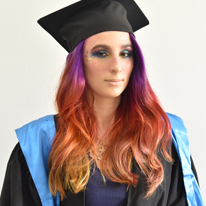
Esma Kurbegovic
$35/hr
Graphic Designer, Illustratior, UI/UX
- Reply rate:
- -
- Availability:
- Hourly ($/hour)
- Age:
- 29 years old
- Location:
- Sarajevo, Novo Sarajevo, Bosnia and Herzegovina
- Experience:
- 4 years
Esma Kurbegović
Artist Portfolio
Esma Kurbegović
Bachelor of Visual Arts and Communication Design
Creative designer and excellent communicator, fast learner. She has been a Freelance designer
and illustrator for 4 years now. Esma first started with illustration, selling commissions since
starting high school. She follows the newest trends in art, technology and design, and she tries to
come up with her own. Her appearance matches her line of work and she believes presentation of
oneself is very important. She spends most of her time on upgrading artistic skills and learning
non-artistic ones which could help boost her career.
Experience (Highlighted jobs)
Personal Info
-.
-Ongoing
01/03/1997
--
Software
Lr
Ps
Id
Pr
Ch
Au
-.
Ai
Ae
Graphic Designer/ GIZ GmBH - Freelance Contrat
•
UI/UX
Curating all the aspects of design: visual Identity and branding design
for Triple Win Project in 5 countries (medical staff relocation and
employment in Germany)
Making posters, brochures, flyers, presentation reports
Photos for newspapers and social media, documenting interviews
Photographer / Dance More Sleep Later Events
-.
Junior Creative director / mTechno Records
•
•
•
•
•
•
Event photography- underground club parties
Retouching and selection of photos for social media
Sending samples to headliners for promotional purposes
create 1-2 albums/EP visuals once per month
Make posters/promotional materials
come up with coherent visual themes
Graphic designer / Argument d.o.o. (Internship)
•
•
Video Editing
Photography
Making all the design material (logos, brochures, banners)
Web design
Coming up with business plans alongside design for each project
Leading, taking full responsibility and being part of each project
-.
-
Graphic design
•
•
•
•
•
•
Des Skills
Illustration
Lead Graphic Designer/ SEO Services Ottawa - Freelance
graphic design intern for public relations agency
in charge of making all the visual materials (posters, photographs,
promotional material, logo, etc).
Education-: International university of Sarajevo, Visual Art and Communication Design
Animation
Accomplishments
Soft Skills
Exhibitions:
2014 Creative Mess- National Galery „Preporod“, Sarajevo- B&H
November 2015. and 2016.- IUS Photowalk, group exhibition- International University
of Sarajevo
Awards:
2008 Youth Art Exhibitions- gold medal. Exhibited in Beijing, Atlanta, Melbourne and
New York (organised by the Ministry of Higher Education in Beirut, Lebannon
2019 - Mistral Music x Hackathon 24-hour competition - 2nd Place
COOKY - An Online
Retail Brand
This was a challenge in creating
a signature branding/visual
identity for an imaginary retail
brand. My aim was to create
a design centering around
Pantone 16-1546 Living Coral,
which is the current Pantone
color of the year.
Dull Red
Living Coral
Light Green
Hex: #b1403c
RBG: 177, 64, 60
CMYK: 22, 84, 72, 14
Pantone 1807-C
Hex: #fd746d
RBG: 253, 116, 109
CMYK: 0, 67, 48, 0
Pantone 16-1546
Hex: #71fda7
RBG: 113, 253, 167
CMYK: 51, 0, 54, 0
Pantone 352-C
Minimalistic,
Modern, Yet Edgy
The design is minimal, yet it
suits a youthful and artisticstyled clothing brand. Diagonal
shapes and framing gives the
website a lot of dynamics and
the clothing selection framing
is unique, compared to regular
online store galleries.
Clothing gallery
Pictures are in the same
matching gradient, but when
hovered over with a mouse,
they fade into the original
colors of each photo. Each
gallery contains a short video,
showcasing the brand’s clothing
on models.
Men’s
Collection
Buy Outfit Windows
Dark Version
Category: Mockups
Tools: Illustrator, Photoshop
I started making my own series of mocku-ups that will be sold on stock websites. I make everything from
scratch, by either making vector shapes, 3D objects with Dimensions/Photoshop, or taking pictures.
Vector art I made:
Pictures I took:
Name: Project Triple Win
Category: Visual identity, advertising, promotional material
Tools: Illustrator, InDesign
I was in charge of managing and creating all design aspects of for the Triple Win project, which deals with
the exchange of medical staff from the Balkans region to Germany. My duties included: Facebook/website
banner and visuals design, logo design, branding/visual identity, promotional material, roll-up, annual report
presentation design, FAQ and ABOUT booklets.
The Logo
Light Blue
RGB Red
HEX: #a8d9e1
RGB: 168, 217, 225
CMYK: 38, 0, 13, 3
HSL: 188.42, 48,72, 77,06
Spot colors: Pantone 635 C
HEX: #ff0000
RGB: 250, 0, 0
CMYK: 0, 95, 91, 0
HSL: 0, 100, 50
Spot colors: Pantone 185 C
Suggested background colors:
White
Chrysler Dusk Gray
Spannish Violet
HEX: #ffffff
RGB: 255, 255, 255
CMYK: 0, 0, 0, 0
HSL: 0, 0, 0
HEX: #4b4f54
RGB: 76, 80, 85
CMYK: 11, 6, 0, 67
HSL: 213, 6, 31
Spot colors: Pantone 7540-C
HEX: #4a3948
RGB: 74, 57, 72
CMYK: 67, 71, 45, 48
HSL: 307, 13, 26
Spot colors: Pantone 7448-C
The Brochure
The Poster
The Roll-Up
The Hand-In
Peckish - An 8-Bit Styled
Restaurant App
This application was designed to bear
the aesthetics of old-school 8-bit
games, as to be more appealing/fun
and possibly trigger nostalgia in the
90s kids. Its Unique Selling Point is the
“Discover Local Specialties” tab.
Filters!
Filter restaurant
suggestions by food type
and additionally by rating
and price range.
Discover Local
Specialties Tab
Based on one’s geolocation, the
application collects data on the
most famous traditional dishes
that can be found in a specific city.
It then shows a list of restaurants
serving this type of food.
Fire Engine Red
HEX: #2f2fbb
RGB: 47, 47, 187
CMYK: 0, 86, 100, 10
Spot: Pantone 485 C
Near-Persian Blue
HEX: #2f2fbb
RGB: 47, 47, 187
CMYK: 92, 80.5, 0, 0
Spot: Pantone 2728
Near-Medium Blue
HEX: #48ccec
RGB: 72, 204, 36
CMYK: 69.5, 13.6, 0, 7.4
Spot: Pantone 2985
Thistle
HEX: #e5c7de
RGB: 47, 47, 187
CMYK: 75, 75, 0, 27
Spot: Pantone 531
The Colour Palette
The
colour
palette
of choice was of two
complementary colors pastel blue and pink, while
the dark blue provides
great contrast and is
reminiscent of the blue
pac-man ghost. The red
was only used on the logo.
The Icon Set
A set of icons was designed
to match the style of the
app and as part of the user
experience.
The Logo and
Typography
PECKISH
8 BIT WONDER
logo
ORANGE KID
App text
The logo was made on a pixel
scale, where each block was
equivalent to one pixel. I have
picked the most appropriate
bold 8-bit font I coudl find for
the logo, while using a clasicall
pixel typeface for the app (both
only come with 1 font).
The Wireframe Preview
green tea and stevia for sweetener.. With this energy drink, I wanted to prove it is possible to make a commercial energy drink that isn’t going to cause harm to users, like most fabricated soft drinks. I have written a
research paper before coming up with the story and visual identity. Through it, I have proven that it is possible to
Name:
Drink Brand
Design)
make
such“Levitio”
a product(Energy
within reasonable
budget
constraints and maintain a competitive price.
Category: Visual Identity, Brand Identity, Graphic Design, Advertising
THE
IDEA
THE
PROCESS
In advertising class we were given the task of coming up with a visual identity and story of an imaginary
energy drink. I decided to call mine “Levitio” and base it arround health, fitness, and mental wellbeing.
I tried to be different and created the story of a supplement-based energy drink with taurine instead
of caffeine. It would contain a plethora of beneficial chemicals obtained from both natural sources
and from chemicals used in fitness food products. Sone of the ingrediets I would put into it are:
ginseng root extract, tea tree, magnesium, vitamin C (both for benefits and flavoring), B12, vantau root,
BCAA, Vitamin E, amino acids, green tea and stevia for sweetener.. With this energy drink, I wanted to
prove it is possible to make a commercial energy drink that isn’t going to cause harm to users, like
most fabricated soft drinks. I have written a research paper before coming up with the story and visual
identity. Through it, I have proven that it is possible to make such a product within reasonable budget
constraints and maintain a competitive price.
Inspiration
Inspiration
TheThe
story
was was
inspired
by products
sold in protein/fitness
shops. I have
seenIahave
variety
ofcaffeinated
energy
story
inspired
by products
sold in protein/fitness
shops.
seen
a variety BCAA
ofcaffeinated
drinks.
is used
to help
aid muscle
workout. recovery
I realized itafter
couldworkout.
be a good
fit for my itdrink,
as be a
BCAABCAA
energy
drinks.
BCAA
is usedrecovery
to help after
aid muscle
I realized
could
I wanted
it towards
youth and
culture. Both
of these
experience
a lot ofBoth
muscle
good to
fit aim
for my
drink,sporty
as I wanted
to the
aimrave
it towards
sporty
youthgroups
and the
rave culture.
of these
fatigue,
so
they
would
be
the
perfect
market
segments
to
go
into.
Last
year,
meditation
and
minfullness
were
groups experience a lot of muscle fatigue, so they would be the perfect market segments to
go into.
buzzwords,
so
I
knew
I
had
to
design
something
which
takesan
example
from
the
practices.
Last year, meditation and minfullness were buzzwords, so I knew I had to design something which
takes an example from the practices.
COLOURS
The design is centered around the following colours:
KIMBERLY
ROUGE
MULLBERRY WOOD
Hex: #807ca6
RGB: 128, 124, 166
CMYK: 57, 51, 16, 2
Spot Color: Pantone 7675-C
Hex: #92346e
RGB: 146, 52, 110
CMYK: 45, 90, 23, 11
Spot Color: Pantone 689-C
Hex: #680735
RGB: 104, 7, 53
CMYK: 36, 100, 38, 52
Spot Color: Pantone 690-C
THE RESULT
The final design is a colorful energy drink can, with a logo inspired by levitating figures from
reference photos. The color scheme and the psychedelic patters are supposed to reminisce of
the state of deep meditational trance. My goal was that the potential consumers instantly get the
feeling the drink promotes good health, just by looking at the bottle. Ive also designed and ad poster,
which is supposed to show off the bottle with a captivating slogan and short copy text that gives
consumers the essential information within the short timeframe of an average person’s attention
span (6-15 seconds).
CIRC
Category: Brand identity design, UI/UX
CIRC is the product of collaborative efforts of 2 team member and myself. It was conceived
during a “Hackathon”, where contestants have 24 hours to come up with a start-up idea connected
to the tech sector. Our idea was to provide a mobile platform which lets the end user dictate the
development of the local nightlife with the help of the app’s innovative niche social media platform
design and user experience. I was in charge of the Logo and the design of the presentation and
content. The idea won 2nd place in the competition.
THE LOGO
PRESENTATION ELEMENTS
COLOUR SCHEME
Spring Green
Ebony Clay
Hex: #00ff7e
RGB: 128, 124, 166
CMYK: 57, 51, 16, 2
Spot Color: Pantone 7479-C
Hex: #1e272e
RGB: 128, 124, 166
CMYK: 57, 51, 16, 2
Spot Color: Pantone 433-C
HOW IT WORKS
The application is free for consumers, however, it
would rely on monthly supscriptions that would be
charged to clubs/event managers, in exchange for
a powerful set of analytics tools,. These tools are
way beyond what, for example, Facebook offers,
in the sense that the data is more accurate. For
example, Facebook Events never shows the actual
number of people visiting an event, while this app
relies on the number of live check-ins, instead of
“Interrested” and “going”. Highly active users are
highlighted to clubs/bars, and in exchange for
their activity, they are offered small incentives,
like a free drink or club entrance for the night.
Having an app free for the actual consumer is very
important for this concept, as all other servies
(Facebook events, Eventbritte) are basically free,
except for the user having to purchase a ticket.
Instead of selling tickets and having our own
processing fees on them for profits, we would rely
on the providers inside our app (the clubs).
THE USER INTERFACE
This tab shows how the application would look
like from the club side. Each club has a profile
created for them, in which the latest events are
listed, as well as tags that are requested from
users (genres). The tags update automatically so
that the most popular one is always 1st in line. The
estimated number of guests is calculated based
on previous event check-ins.
Name: “Where Have You Gone (Anywhere)”
Category: Music cover artowrk, illustration, Photoshop, UX
THE IDEA
Studying the title and listening the song, I found it to be very colourful and story-telling. Whenever I see or hear
the word “anywhere”, it always makes me think about the universe, the stars, daydreaming and fantasies. The
song to me seems like a love story, so I wanted my design to showcase love in some way. I also knew I should
use a lot of vibrant and harmonious colours. I decided to go with illustration, instead of using just photos and
some graphic elements + effects. It was a risky move, having in mind the previous cover designs for Lucas &
Steve. My idea would be quite different from the other release covers. But since the tagline of the contest is
“Remix it, Refresh it, Redefine it”, I thought there needs to be something new, original and out of the ordinary.
Something unexpected- gasp-inducing, dare I say. I thought You would appreciate the creativity and out-of-thebox thinking. So it was settled- I am definitely doing an illustrated cover!
THE PROCESS
Inspiration
“Where Have You Gone” instantly made me thing about a person who’s been separated from the love of his life.
He wanders the planet hoping to find her again.
“Anywhere” - He hears a voice inside his head saying- “I am anywhere you want me to be. You always carried
me in your heart”. She is his whole universe, everything around him- the air, the earth, the water... As she has
metamorphosed into an actual universe, Now, she is holding his world afloat, close to her heart. His world shines
bright and everything around them is full of colours. They will always stay in this perfect balance.
References
As I wanted to incorporate stars or people in space into the illustration, I found that these references gave me a
good starting point:
THE RESULT
Getting to this phase was a real journey! My design took a few unexpected turns- there was a lot of re-painting
and struggling with anatomy and realism. I’ve made a lot of changes to the colours, the layout of values and
textures until I felt everything was good enough. It was quite challenging and stressful (because I was pushing
myself so hard to achieve near perfection for myself). This work has been so motivating and exciting for me!
